projects
LinkLair
Posted on:2026-03-21Ung i Världen Website
Posted on:2024-08-24Bar Total 🌼
Posted on:2024-08-24Terminal Website
Posted on:2024-02-03Randomantagning.se
Posted on:2024-01-16Picture of the day Webplayer
Posted on:2023-04-07
LinkLair is a forum style rss reader for both reading and discussing rss feeds. Sign in with github, google or apple and subscribe to your feeds. Cross-post to the forum categories to discuss with other users by commenting. Both forum and rss posts for feeds you subscribe to are visible in your timeline feed (site root).
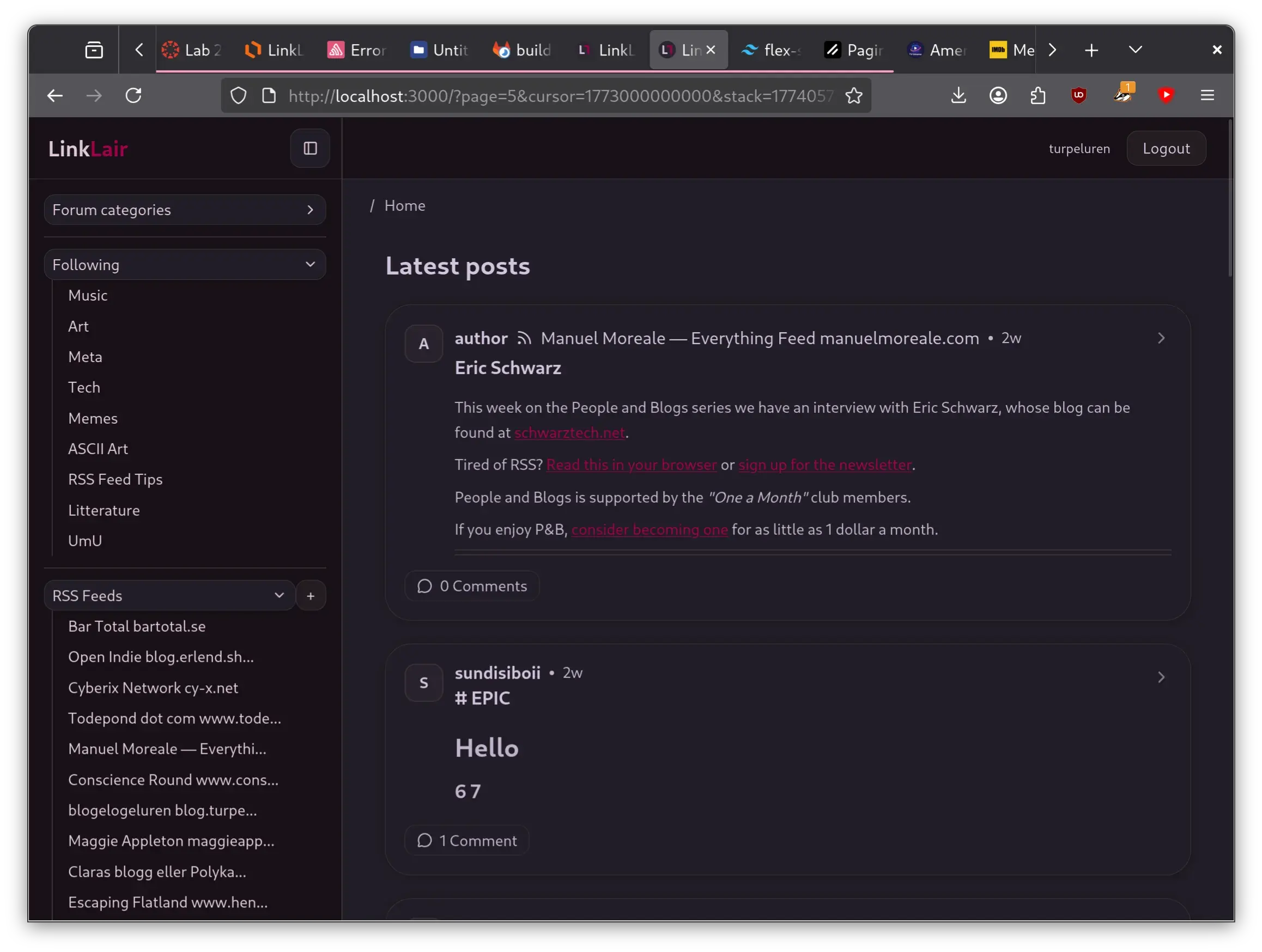
LinkLair was developed as a project in a university database course by me and bl19, who is currently hosting both the site and the database. The backend is written in Rust with actix-web and the frontend is Next.js. We are not very actively developing it further than the minimum viable product but might come back to adding more features. Please let us know in /feed/meta if there’s anything youd link to see added.
I’m starting to use it as my main feed reader, so time will tell if anything needs changing to be usable. I might already want to add grouping or silencing to avoid ceirtain feeds overtaking the entire timeline.
Please post your rss feed tips in /feed/rss-tips!! I’m posting some of mine rn, byeee
Link 😸
Ung i Världen is a EU-funded non-profit organisation empowering Swedish youth to explore the development sector, the aid industry and global careers. Basically it is a platform for youth who want to be a part in making the world a better place.
Since one of the founders of Ung i Världen is a close friend of mine, I volunteered to make the website. For both the challenge and merits of making an “actual” site, and to just help out with a good cause.
The development went very much in parallel with that of Bar Total, which came to act as a lower stakes, more minimalistic, lawless testing ground for much the same tech used for Ung i Världen.
Tech
The site is built using Astro, based on the free AstroWind theme by onwidget, and deploys with Netlify. My client editors can publish through the Decap Content Management System (formerly Netlify CMS) which integrates easily with Netlify Identity for editor access. I’ve long wanted to make sites for others but couldn’t find a good way combining both total freedom to customise and an easy way for the client to update content, until I found this CMS!
New members sign up using a form on the site which is hooked up to Netlify forms and sends an email on new submissions. My novice developer friend almost had the submissions hook up straight to a google spreadsheet and if I had more time to work on the project, this would definitely be a priority.
Another priority would probably be some basic level of search engine optimisation. I don’t think the site even shows up on googling “Ung i världen” so it really needs to be added to some indexes for potential members to even find the site they are looking for. This is easy to fix however when I have the time.
Evaluation
With the help of my family members, a small amount of user experience evaluation was conducted which informed me of some caveats in the website flow as well as some confusion regarding both the nature of the organisation and the different types of member applications. Some of this boils down to the sites copy, which since testing its editors has made clearer on a few points. I also received detailed instructions from the client on how to organise the site, some of which I would have laid up differently to ease the flow of information for the user. (E.g. linking quicker to the about page)
Final notes
This project has been really valuable for me in working with an actual client with demands and producing a professional looking website. We were obviously a really small team (I developed the site in close collaboration with my founder friend who started learning to code along the way, going of design mock-ups by another founder) and didn’t have a lot of resources or experience but we managed to make something I’m proud of. In retrospect, me and the client could have cleared up some of the demands a bit earlier, as well as communicated more tightly along the way, but now I’ve done my first work as “consultant hired by an organisation to make a website“ (except I was paid 0 of the $$$ a web dev earns).
A lot of my work on this site came down to the front end design, which I find quite fun to work on. The look really went from corporate SaaS site to youthful organisation in a way I’m very happy about! I am also very particular with the details and have spent way to long fixing small CSS issues etc. Please let me know if you find any problems with the site!
Link 😸
Backlinks
Bar Total is an all encompassing concept by my friend group which I brought into the www this summer in the form of a webpaper (read: blog). Located at https://bartotal.se, or my favourite https://bartotal.digital (no longer with us 😢), the Swedish Gothenburg based journal enables me and my friends (some of which are actual journalists in training) to dabble in the written arts and engage in the cultural sphere.

I learned a lot from building the site and I think the look came out clean and focused. Since it’s been such a fun project I’ve put a lot of time not only in the website but also doing art and “”marketing”” lol. Writing about whatever in Swedish under pseudonyms and in collaboration has also been freeing!
The development went very much in parallel with that of Ung i Världen, with Bar Total acting as a lower stakes, more minimalistic, lawless testing ground for much the same tech used for Ung i Världen.
Tech
The site is built using Astro, based on the Astro Cactus theme by Chris Williams, and deploys with Netlify. My fellow editors can publish through the Decap Content Management System (formerly Netlify CMS) which integrates easily with Netlify Identity for editor access. I’ve long wanted to make sites for others but couldn’t find a good way combining both total freedom to customise and an easy way for the client to update content, until I found this CMS!
I am proud to have improved on the comment system of this site by adding easy moderation of new comments, with no need to git push from my computer. The sites static contents are updated using Netlify functions via a password protected form accessed and populated through a link in the new-comment-notification email. Thanks to GreenAsh’s amazing article detailing this kid of setup! Netlify really does all the heavy lifting but the system works like a charm and all comments gets happily stored in plain json in the repo and thus will live forever.
Next up is figuring out how to best send emails to the newsletter subscribers at every new post. Since we’re very small I am still storing the mailing-list manually and have been sending plain text emails to notify of new posts. Even though the subscriber numbers most likely will stay very manageable I want to send out good looking html-emails soon.
Final notes
This project has been and continues to be great fun! It’s great to work creatively with others and so nice to have our own little platform! We are still finding our footing regarding what exactly to write about and really what Bar Total even “is” — a process I am throughly enjoying. As uni is starting I am however grateful the site is working without hassle. Stickers are coming soon here!
Links 😸
We also have a Twitter/X and an Instagram which you can find on the site.
Backlinks
Background
During the autumn I stumpled upon the existence of the VRChat rave scene through an epic Dj set by woodgraves. The aesthetics and the total internetness of the scene mesmerized me, especially that of big VR club SHELTER, whose posters I adored. Their website, is in terminal format and I thought it was the coolest! I looked through the source code (they even have a little easter egg there) and found that the site was just copied and re-skinned from Sat Naing who in turn was inspired by m4tt72 and Forrest. There are probably plenty more terminal pages out there, feel free to send them to me! It was also through Sat Naing and his Astro Paper theme for Astro that I eventually got working on this blog!
Obviously I had to create my own terminal page. I didn’t do anything fancy, just went with what I knew and html’d and JS’d it with minimal CSS. It is currently the index page of the turpelurpeluren.online domain.
Commands
I am no pro when it comes to the command line and have probably not stuck to conventions when it comes to the commands and arguments etc. These are the commands implemented so far and the list you see when typing help.
about                   - about me and the page
cat [file]              - prints contents of a file as text
cathtml [file]          - prints contents of a file as a webpage
clear                   - clears the screen
goto [subpath]          - follows the URL path (from turpelurpeluren.online/)
help                    - displays information about builtin commands
history                 - view command history
index                   - indexes site pages
links                   - lists my external links
message [name] [cont... - sends me a message
welcome                 - displays the boot message
The most interesting (and messy and weird) command is probably cathtml which prints an iframe with the contents of a sub page. I like recursion so of course you can print out the terminal page multiple times and use the terminal in multiple layers of itself.
Link 😸
| Backlinks |
|---|
Back in 2021 while I was “studing” Spanish in Barcelona, me and my friend were looking for what courses to apply for next semester. For context, all university corses and programs are free in Sweden and you apply to them through a central website called Antagning.se. They have many filters and tools to find what’s right for you, but me and my friend were not ready to commit to our lifes true path quite yet. What we really wanted was a button that would generate a totally random course from the tens of thousand avaliable.
Back then we didn’t know how an implementation of this was possible, but around a year later, I hacked together Randomantagning.se with the little Javascript I had managed to learn and a python package called Selenium.
The solution is really sub-optimal and I need to scrape the site every semester (which takes a whole night, and works like a snapshot of the current state of antagning.se) to keep the site updated. At least it has it’s own domain and people think its funny. In the future maybe I can find a way to update it dynamically.
As of 2024-03-18: I did an update to the scraper script.
Below are some of the best courses I found from spring 2024:
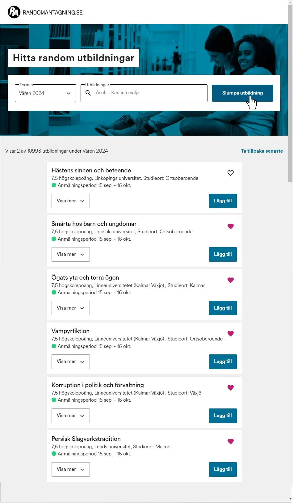
Translates to:
The horse’s senses and behaviors
Pain in children and youths
The surface of the eye and dry eyes
Vampire fiction
Corruption in politics and management
Persian percussion tradition
Link 😸
| Backlinks |
|---|
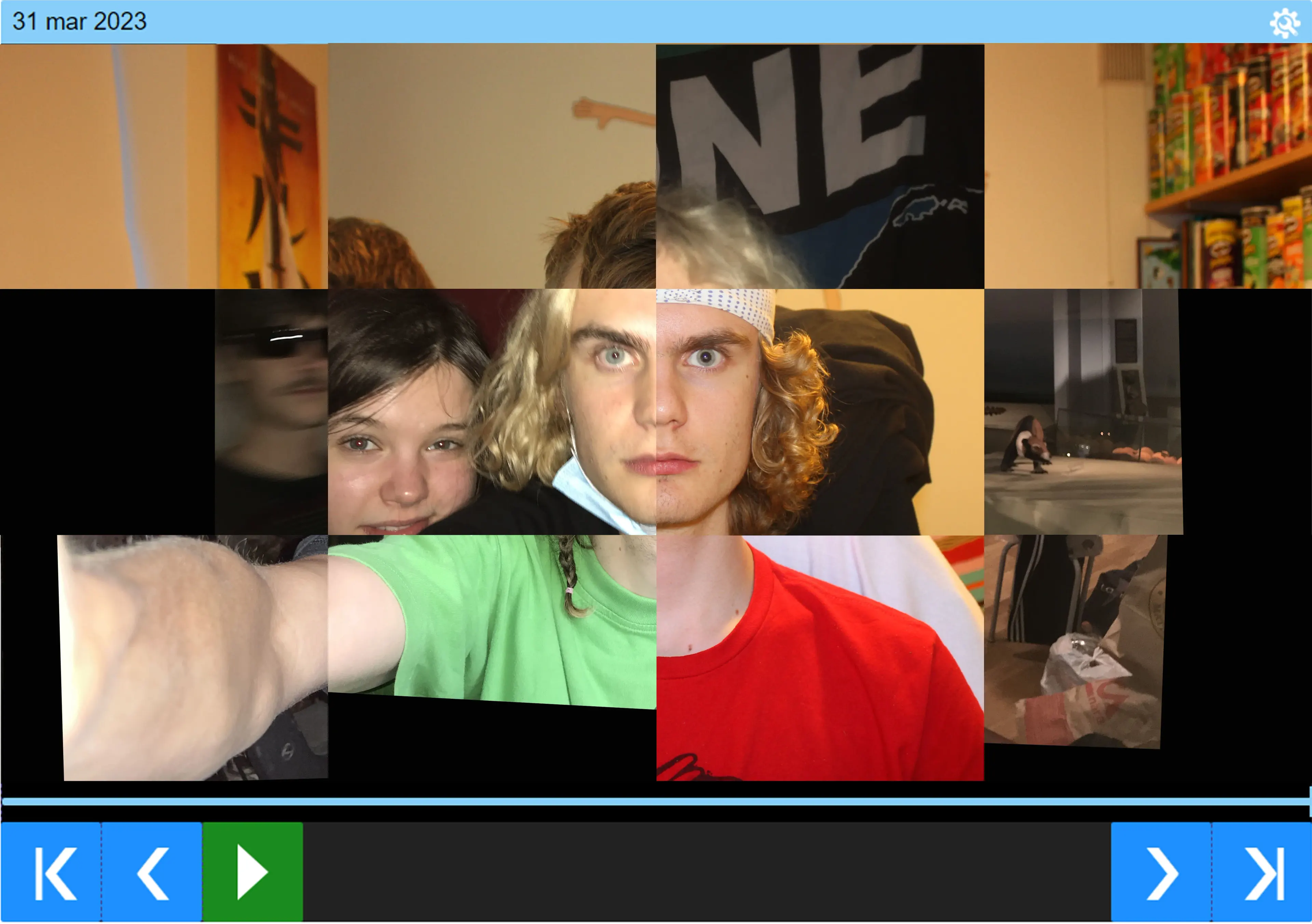
For more than five years I have taken a picture of my face every day. Now the archive is interactive and readily avaliable online for anyone to browse through at their own pace.
Check it out on its own page or use the embedded version below!
The player has support for flipping one image at a time, playing at desired fps and dragging across the timeline.
It also has an option in the settings menu for onionskin time, which means the time it takes to fade into the next image. Highly recommend to play around with this setting.
Open the settings menu with “s”, play with Space or flip one image with the arrow keys.
Building it
I first got this idea while streaming the process of stabilising the images (which I do manually in Photoshop). Since the files on my computer are organised in folders like year/month/day I though it wouldn’t be too hard to have a pointer of the same format and display a correct image.
I realized there was no way I could upload all the (over 1800) images to my own website. As of now I am hosting this via github pages where a 5GB storage limit is “strongly recommended” whatever that means. My site is already over 1GB and the pictures of the day are about 6GB in total. So just uploading them to github would not be a long term solution.
Next step was then to use an image hosing service, and I already had some of the pictures uploaded to google drive in the same handy folder organisation. When I looked into it, however, there is no way to automatically fetch the url of an image in google drive according to file hierarcy. Each file is just given their own random string as url and that is the only way to get the image link.
I couldn’t find any image hosting which did what I wanted and had easy-to-access urls. So, I just started uploading some images to imgur, pasting the individual urls in an array in my Javasript file. The iea was to just put a long list with all the urls ready to access for my website program. But to get all the urls in place I had to manually upload each image and copy the url to the file, even adding the date by hand.
With just a few images I got the code working for the player. Adding the onion skin fade effect and seeing the player work really made me want to finish the project.
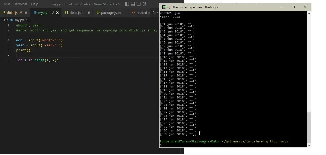
So I started uploading and adding the first few months of images manually. It took forever so I decided to just automate my own writing of the dates in the array. Each line looked like
["day month year", "ImgurUrl"].
I did a quick python script to generate a months worth of lines for me to paste the urls into.
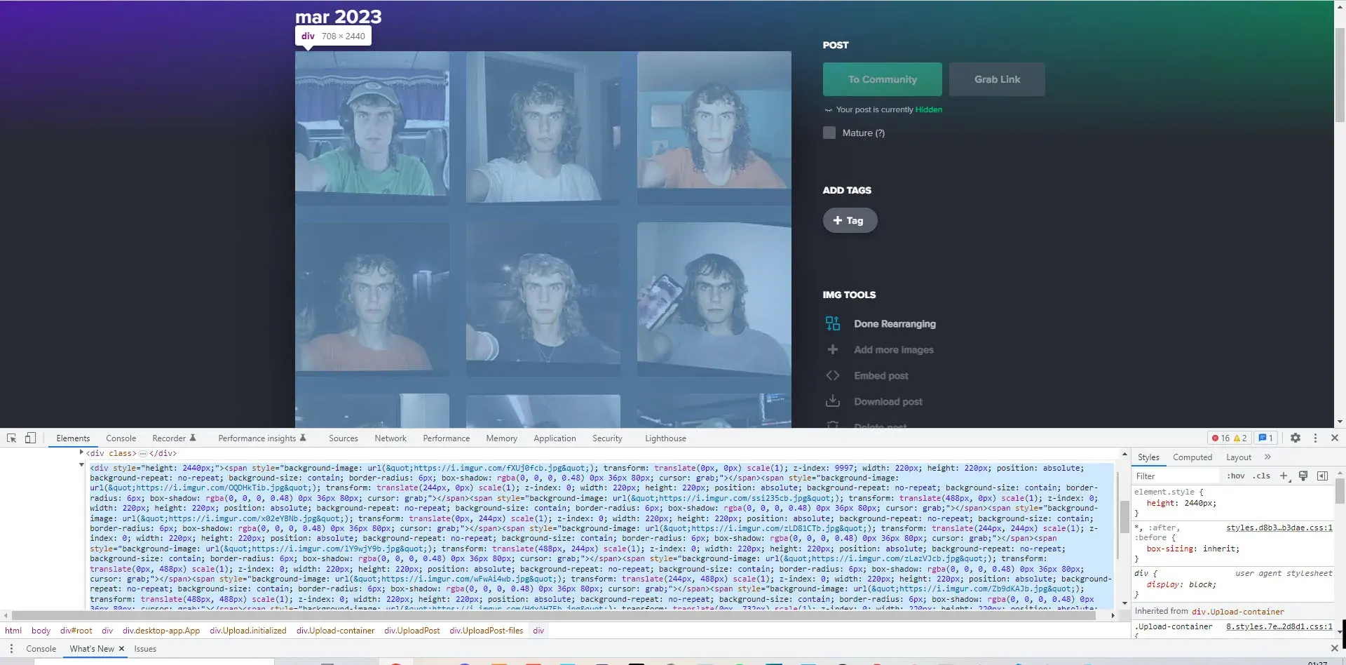
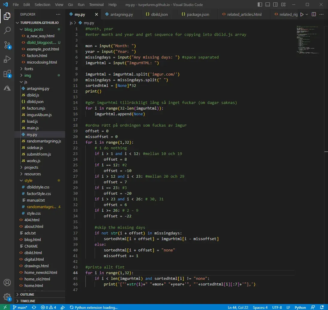
After this, my process was super bottle-necked only by the uploading of images to Imgur and copying their urls. I started to upload one month at a time to an album and noticed the order, (which I had first thought was random and affected only by the upload speed of each image,) followed 1 10 11… 2 20 21.. 3 30 31 4 5 6… Now when I knew there was a pattern to the order I could inspect the elements on the web page, copy the HTML data and with some python string splicing extract the url parts I needed. Then it was just a matter of getting them in the right order.
I expanded the python program to take the raw HTML as input and now it was spitting out a full month of organised array code for my Javascript file. 60 months with this method did not feel as much as now when I am realizing it was 60 months… But using the algorithm felt very rewarding and I got the site running with all the pictures in no time.
This article was originally posted on turpelurpeluren.online.
| Backlinks |
|---|
